Applying Color Theory to Graphic Design

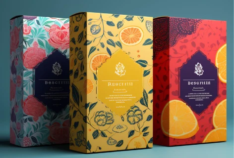
Color is a fundamental graphic design element, crucial in conveying messages, evoking emotions, and influencing perceptions. Understanding color theory is essential for designers to create impactful visuals that resonate with their audience. Imagine a sleek and minimalist box for cosmetics products adorned with vibrant hues that pop off the shelf or a food packaging label with rich, inviting colors that evoke appetite and freshness. Picture a luxurious perfume box bathed in deep, elegant tones or a playful children's toy packaging bursting with bright, cheerful colors. As we explore color theory, we'll unravel the magic behind these captivating packaging designs and discover how they win over hearts and minds.
Understanding Color Theory:
Color theory studies how colors interact and how viewers perceive them. It encompasses various principles and concepts that guide designers in selecting and combining colors effectively. At the core of color theory are three fundamental properties: hue, saturation, and value.
Hue: Hue or shades refer to the pure spectrum colors, such as red, blue, and yellow, as well as their various shades and tints. It represents the primary color family to which a color belongs. In graphic design, understanding hues allows designers to create harmonious color schemes that convey specific moods or messages. For example, warm shades like red and orange evoke energy and passion, while cool hues like blue and green convey calmness and tranquility. Soft and soothing pastel color shades are mainly used for packaging products for children and women. On the other hand, many luxury product brands prefer colors like red and gold which evoke warmth and luxury.
Saturation: Saturation, also known as intensity or chroma, refers to the purity or vividness of a color. A highly saturated color appears vibrant and intense, while a desaturated color appears more muted and subdued. Saturation plays a significant role in creating visual impact and establishing hierarchy in design compositions. Designers can use saturation to draw attention to critical elements or create subtle nuances.
Value: Value refers to the lightness or darkness of a color. It is determined by the amount of white or black added to a hue. High-value colors are lighter in tone, while low-value colors are darker. Value is crucial for creating contrast and depth in graphic design. By manipulating the value of colors, designers can emphasize focal points, create a visual hierarchy, and enhance readability.

Applying Color Theory in Graphic Design:
Now that we have a basic understanding of hue, saturation, and value, let's explore how these concepts are applied in graphic design.
Color Harmony: Color harmony refers to a design's pleasing arrangement of colors. Different color harmonies, such as complementary, analogous, and triadic, can create balance and visual interest. For example, complementary colors that are opposite each other on the color wheel create a dynamic contrast when used together.
Branding and Identity: Color is vital in branding and identity design. Companies often use specific colors to evoke emotions or convey their brand values. For instance, the vibrant red of Coca-Cola's logo exudes energy and excitement, while the calming blue of Facebook's logo represents trust and reliability.
Mood and Atmosphere: Colors have the power to evoke emotions and set the mood of a design. Warm colors like red, orange, and yellow are associated with warmth, energy, and optimism, while cool colors like blue and green evoke calmness and serenity. Designers can use color psychology to create designs that resonate with their target audience.
Visual Hierarchy: Color establishes a visual hierarchy within a design, helping to guide the viewer's attention and organize information. Bright, saturated colors tend to draw the eye, making them ideal for highlighting essential elements or calls to action. Conversely, muted or desaturated colors recede into the background, allowing other aspects to take precedence.

Color theory is a foundational aspect of graphic design, influencing every aspect of the creative process. By understanding the principles of hue, saturation, and color value, designers can create visually compelling and emotionally resonant designs that captivate their audience. Whether branding, marketing, or user experience design, color is central in shaping perceptions and communicating messages effectively. As designers continue to explore and experiment with color, they can unlock endless possibilities for creative expression and innovation in the ever-evolving world of graphic design.


